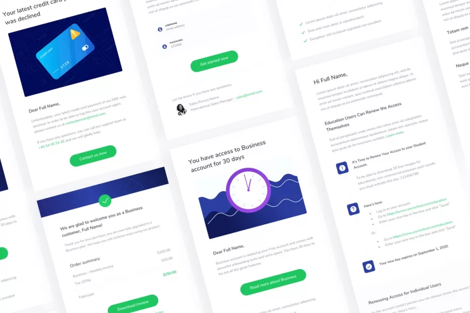
In order to get more customers, you need a great email design.
Emailers are important because they go out when your target audience is most likely checking their email.
A poorly designed sales email newsletter will not bring in the desired results and this can have an adverse effect on your business growth.
To avoid this outcome, I recommend that you follow the example of these top businesses and implement their emailer design styles.
Although using an effective newsletter template is important, it should not be a substitute for quality content.
If you struggle to write quality copy, do check out my article about copywriting tools.
So without any further ado, here are the examples for your newsletter design inspiration.
1. One of the easiest ways to bring more joy into your emailer is through colors
Did you know that different colors can have an effect on emotions?
In fact, according to a study conducted by researchers at the University of British Columbia in Vancouver and published in The Journal of Consumer Research, people were more likely to make purchases when shopping online if they saw red.
This was especially true for those who are impulsive shoppers.
Although this finding is not conclusive, it does give you an idea of how people react to colors.
Therefore, when designing your emailer newsletter templates and layouts, make sure that the color palette matches with what you are selling.
For example: If you’re selling beauty products then use a lot of pink shades or if you are into the food business, then make use of red and yellow colors to trigger appetite.
It’s a simple trick, but it works!
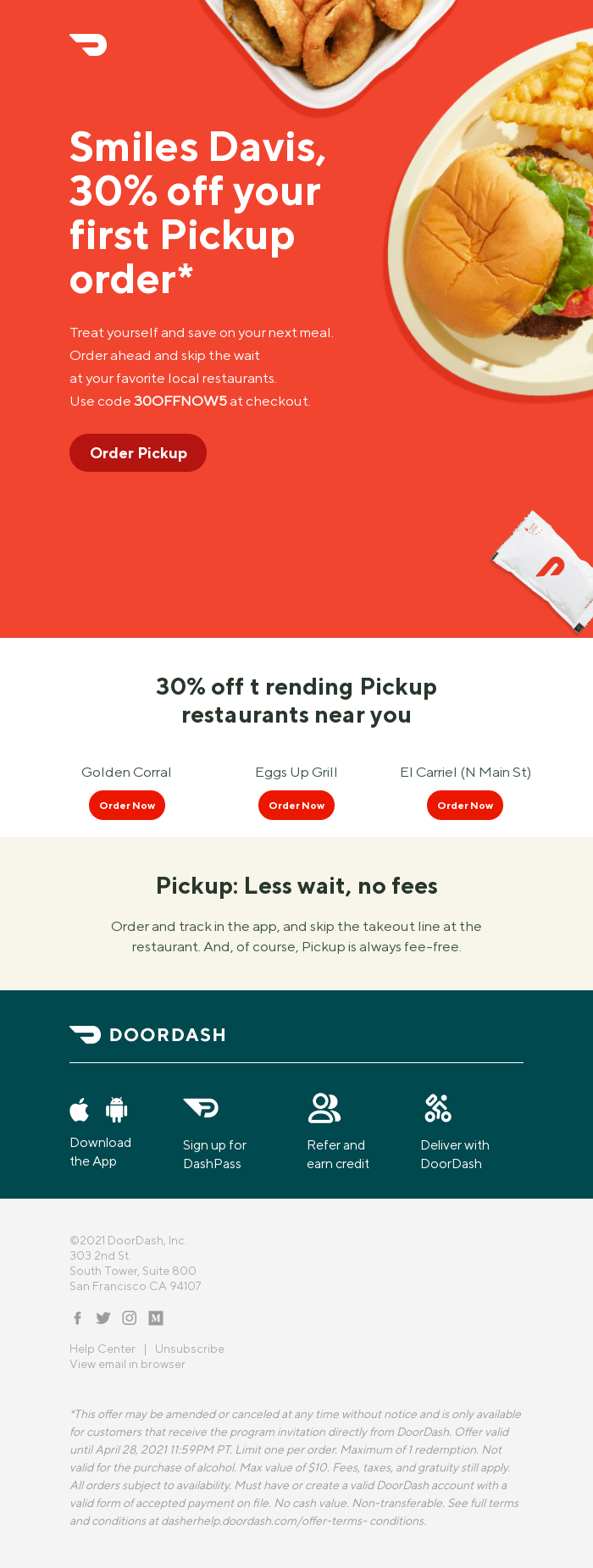
2. Use multiple call-to-actions (CTA) in your emailer
It’s important that you use more than one CTA to increase your chances of getting a customer.
If the first two CTAs are ignored, then it makes sense to provide the next ones in descending order.
However, be careful not to bombard people with too many links and calls-to-action because they might get irritated and unsubscribe.
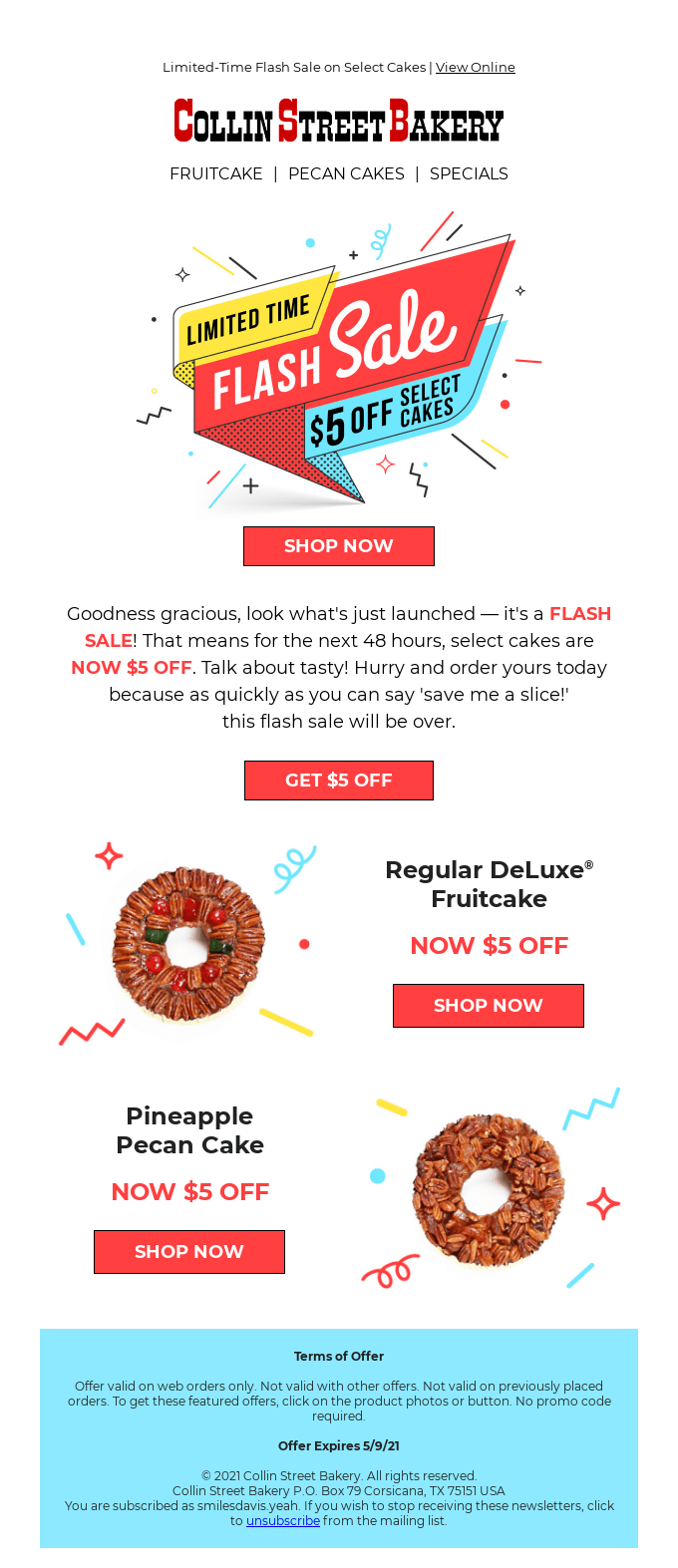
3. Sell benefits, not products
When you’re writing your emailer, always think about the benefits that your product can bring and how it would change lives.
This will convey a better message than saying “buy our products because they are great.”
Emailers with high conversion rates have this in common: They focus on selling people’s problems and not just a product.
This is how you will get more customers to click your emailers and visit the links inside them.
Your message should always be focused on selling benefits, not products or services.

4. Use emotions in your emailer copy and visuals
Emotions can get people to take action.
For example, if you are selling health and wellness or beauty products then use words like “love” and “beautiful.”
This will trigger a positive emotion in customers making them more inclined to click on the links inside.
This is especially helpful for emailer campaigns on mother’s day, valentines day, and Christmas.
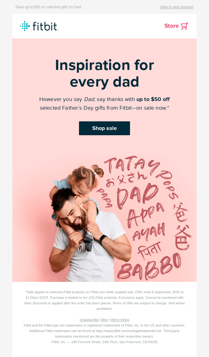
5. FOMO is alive and well
FOMO or the fear of missing out is powerful, especially in email marketing.
If your emailer campaign has a solid call-to-action with an eye-catching design then you will have more people clicking on it.
This means that they are not only interested in what you’re selling but also want to be a part of the group that is using your product or service.
This is an important point to remember when designing emailer templates and layouts because it will sway customers into clicking on the CTA buttons in your campaign.
A good example to follow is those companies that use countdown timers for their campaigns.

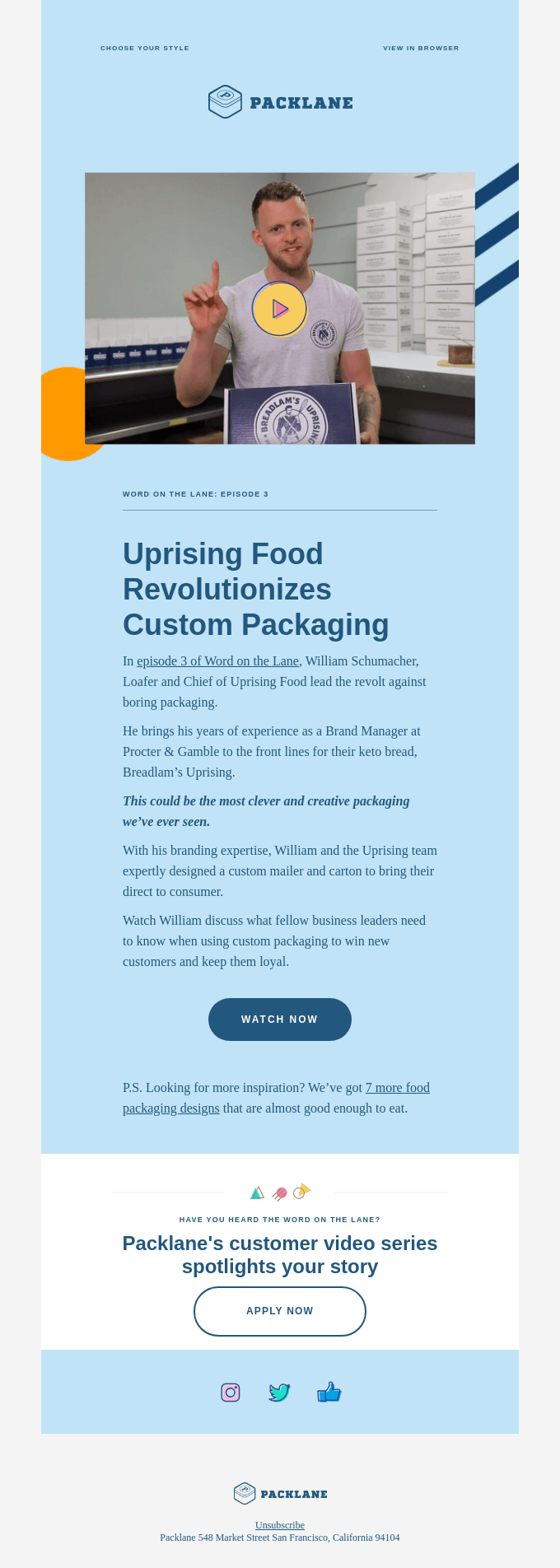
6. Include videos in your emailers
By using company or product videos in your emailers, you can convey a message in an instant.
People are visual so if you have a good video of how the product or service works then it will entice customers to click on that link and become interested in what you’re selling.
A warning though: If there is no call-to-action button within the video, then it won’t be as effective.
People must know the next step they need to take after watching a video and this is usually clicking on a CTA button inside your emailer campaign.
7. Less is more when it comes to newsletters design
It’s understandable that you want to share as much information about your business or product in your emailer.
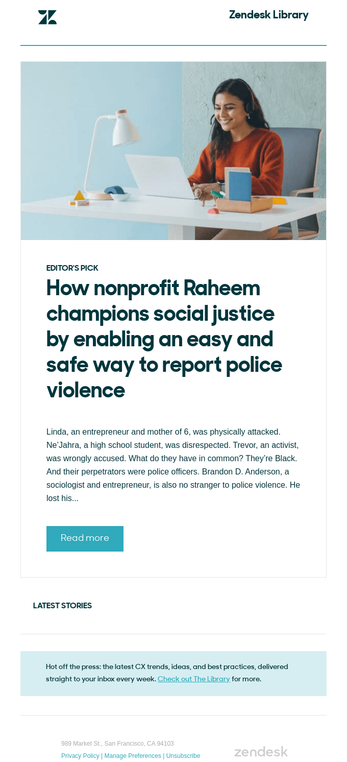
However, it’s best not to bombard people with too many links and articles because they might get confused.
Limit yourself when writing the copy of your emailers so it remains concise but still conveys a powerful message.
Again, focus on highlighting the benefits and don’t just try to sell products.
8. Split your emailer layout into sections
The easier it is for your customers to understand what you’re offering them, the more likely they are to take action.
A good way of doing this is splitting up your email into different sections so it’s well organized and easy to read.
This is especially useful if you are trying to target multiple audiences because they won’t get overwhelmed with information.

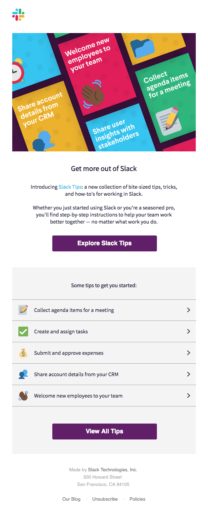
9. Make use of icons and emojis in your emailer designs
Using emojis and other icons in your emailers is a great way to convey information quickly.
This will allow customers to process what you are saying about the product or service at a faster rate than just reading boring text on the screen.
It’s important that your CTA buttons stand out from these images because they must be easy for customers to click on.
If you can do this, then it will be much easier for them to take the action that you want from them which is clicking your emailer links and visiting your blog or landing pages.
10. Big and bold – less text-heavy designs
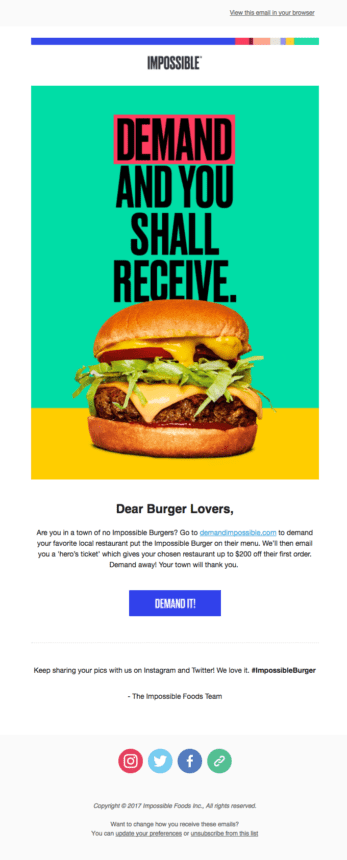
When designing an email template, it’s best to make the design bold and powerful.
This is because people will be more inclined to take action if they see a big CTA button or banner with minimal text on it.
The fewer words there are the better because you want customers to click on that link quickly without spending too much time reading.
Conclusion:
The design of an emailer is only as good as the number of people who open it.
The subject line is one of the most important aspects of emailers, if your subject lines do not attract people’s attention then you might as well hit the delete button right away.
Pay special attention to the subject line of an email because people are constantly looking for those emails that can be useful to them.
The design of your emailer is also important and should not look spammy, you have to make sure it looks professional at all times even if you have a limited budget with no big-name agency working on it!
It’s important to have a clear headline or banner so readers know what they are clicking on (don’t leave your image ALT tags empty).
Include a mix of images and textual content, as this can grab someone’s attention and keep them reading.
Incorporate links to encourage the reader to click and visit your website – these should be in the form of ‘See our latest post’.
Ensure that you also share other people’s work, it increases authenticity.
You could offer incentives for people sharing your email with their friends using “Share this page with your friends,” or running competitions using “Enter now” buttons that are prominent on each page.
I hope these design tips will give you some inspiration when creating your next email.
Good luck!

Ali is a digital marketing blogger and author who uses the power of words to inspire and impact others. He has written for leading publications like Business2Community, Inc. Magazine, and Marketing Profs. When not writing, he enjoys spending time with his family.
