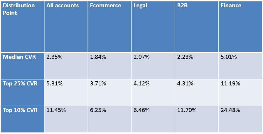
A website conversion rate of 3%-5% or more is a reasonable expectation for most small businesses.
Although we’re used to hearing the term “conversion” in relation to sales, it doesn’t have to be that way.
It’s also possible to measure conversions along with other metrics such as newsletter sign-ups or downloads of informative white papers; Just substitute “download” for “purchase.”
I’ve worked with small business clients who have consistently achieved a conversion rate of excess of 10%, so don’t be discouraged if your current website isn’t converting as well as you’d like.
If you haven’t checked yours’ recently, it could need some attention. Here are 8 ways to improve your website’s conversion rate.

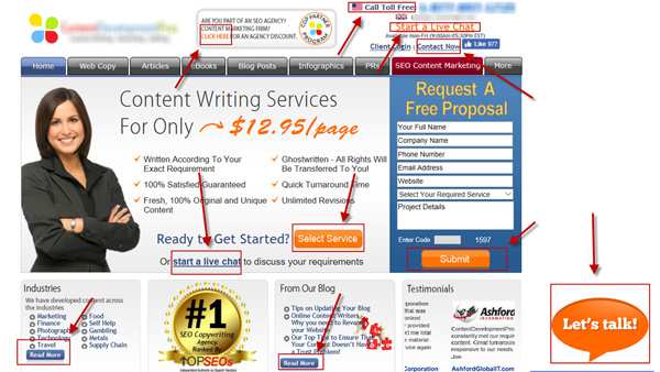
Get more clicks on your blog or website
Although it’s not necessary to get all visitors to your blog or website to click on a button or link, I find it helpful to see how many are making the effort once they arrive.
This is an avenue you can use for tracking and measuring their level of interest.
It’s also possible that they’re just browsing and haven’t made up their minds about clicking, so more options will keep them on the site longer.
Reduce the number of clicks it takes to get to your goal page
The first thing you have to do is establish what that is — whether it’s a particular product and/or category or an action such as newsletter sign-up or event registration.
Once you’ve done that, it’s time to focus on the series of pages it takes visitors to get there.
Is what you’re offering clear?
What happens if they click and there are multiple options?
For example, does your website offer a product or service with multiple variations that need different descriptions and images?
If so, it may be best to just have one main page and link to others that contain the sub-categories.
Have one goal per call to action button and make it immediate
If you want people to sign up for your newsletter, why not put a big “Sign Up” button on each of your pages?
If they’re interested enough already, couldn’t they just be encouraged to sign up right then and there?
If so, delete the first option and put the “Sign Up” button at the top of each page.
It’s also a good idea to make its purpose clear by making it say something like: “Get useful tips and information about _____.”

Smell check every page on your website
Get in the habit of smelling each page before you launch it.
If, for example, you’ve just finished a blog post about new products and there’s no mention of them on the product category page, then don’t be surprised if someone comes along and asks about those items when they get to that point in their visit.
And if they left your site before reaching that page, you can’t be positive that they didn’t do so because of a lack of interest.
Is it all about the sale?
Pushy sales tactics are one way to increase your website’s conversion rate, but what if there’s another approach?
What if people were invited to learn more about your products and services, but were also invited to opt-in to a free or occasional newsletter where they would receive helpful information before making a purchase?
To make this idea work, you need to provide useful and engaging content that is only offered on your website. If other sites are offering the same articles or tips, then you’re not being unique.
It’s also important to provide enough information for people to make an informed decision, but not so much that new visitors become overwhelmed or confused and leave your site before reaching the buy button.
Check and optimize your website speed for better conversions
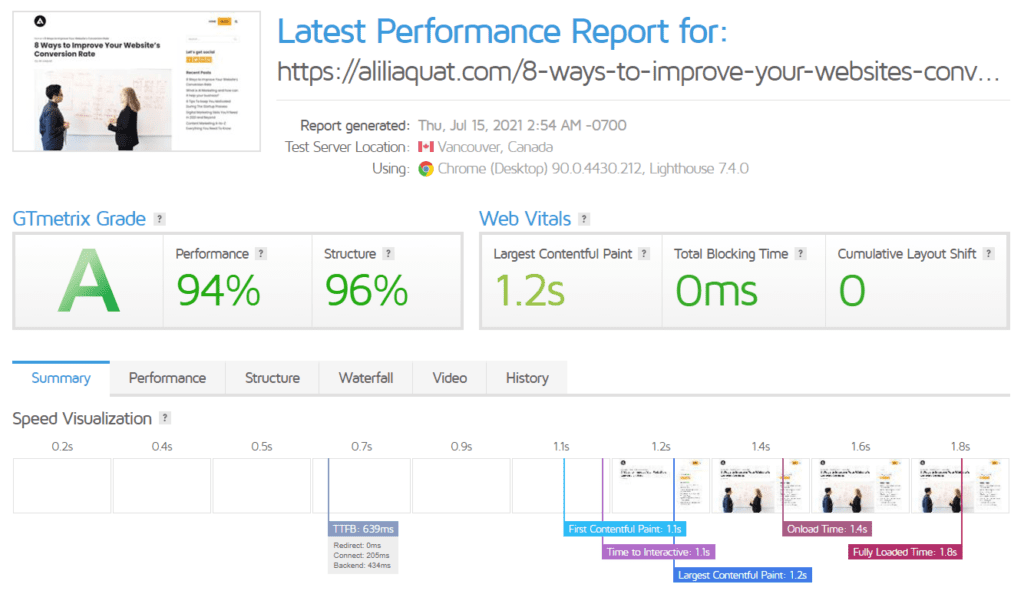
Website speed can have a considerable impact on your conversion rate, so it’s essential that you give this some consideration.
Most people don’t notice how long it takes for a page to load because they’re not expecting pages to take much time.
But if a page takes one second longer than expected, they’ll think twice about revisiting the site.
Also, slow-loading pages can be a major contributor to bounce rates, so aim for performance that is as fast and seamless as possible.

Add more value with an educational element
Your goal should be to position yourself as the industry expert, so choose your words carefully when you’re presenting your content or product information.
The trick is to teach your visitors about a topic, but place enough value on the product so that they’re inspired to buy it when they see how much it will improve their lives.
To sum up, if you’re not on a mission to educate your visitors, then they probably won’t be inspired to become customers.
One of the most basic reasons that conversions are lower than expected is because website owners have forgotten about the value exchange.
If someone has taken valuable time out of their day to visit your site, consider rewarding them with something more meaningful like a free consultation or a downloadable checklist/guide.

Ali is a digital marketing blogger and author who uses the power of words to inspire and impact others. He has written for leading publications like Business2Community, Inc. Magazine, and Marketing Profs. When not writing, he enjoys spending time with his family.
